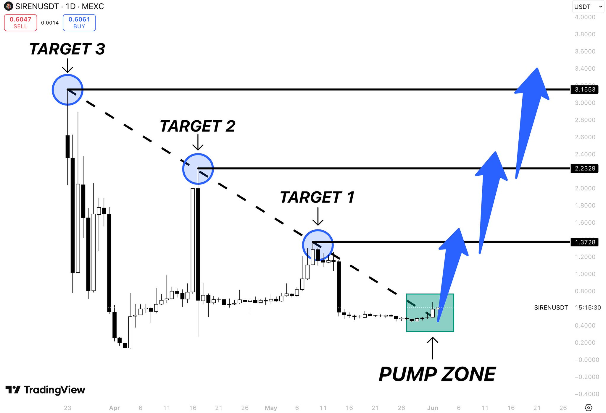
$SIREN doesn’t have years of history
That’s exactly why this chart is interesting
Most traders look at new tokens and see a lack of data
This chart looks at $SIREN and sees a series of lower highs getting compressed into a single point
Target 3 → $3.15
Target 2 → $2.23
Target 1 → $1.37
Those levels aren’t random
They’re the exact zones where previous rallies lost momentum
Now price is sitting inside what the chart calls the Pump Zone
The area where the descending structure finally runs out of room
Think of it like a spring
Every rejection pushed the ceiling lower
Every month reduced volatility
Every month tightened the range
Eventually compression stops creating pressure
It releases it
If that release happens, the first objective isn’t a new all-time high
It’s simply reclaiming the levels that once acted as ceilings
And for a small-cap chart like $SIREN, reclaiming old ceilings can be where the real move begins